Redesign of mobile game

4X Mobile Strategy. Players collect heroes, command an army, build a base, and face the Iron Order in battles. Portrait orientation.
UI/UX designer
8 month
Low in-game purchases, short session lengths, and poor retention rates. Players found the experience too complicated and outdated, leading to disengagement and reduced long-term play.
Introduce clearer value propositions for items and currency in store. Improve early-game pacing to hook players faster. Upgrade Onboarding & Tutorial Completion. Improve visual feedback to make battles immersive and rewarding.
Design and optimize user interfaces to improve navigation, engagement, and overall player experience. Collaborate with game designer and developers to create user-centered experience across all game elements according to the goal.

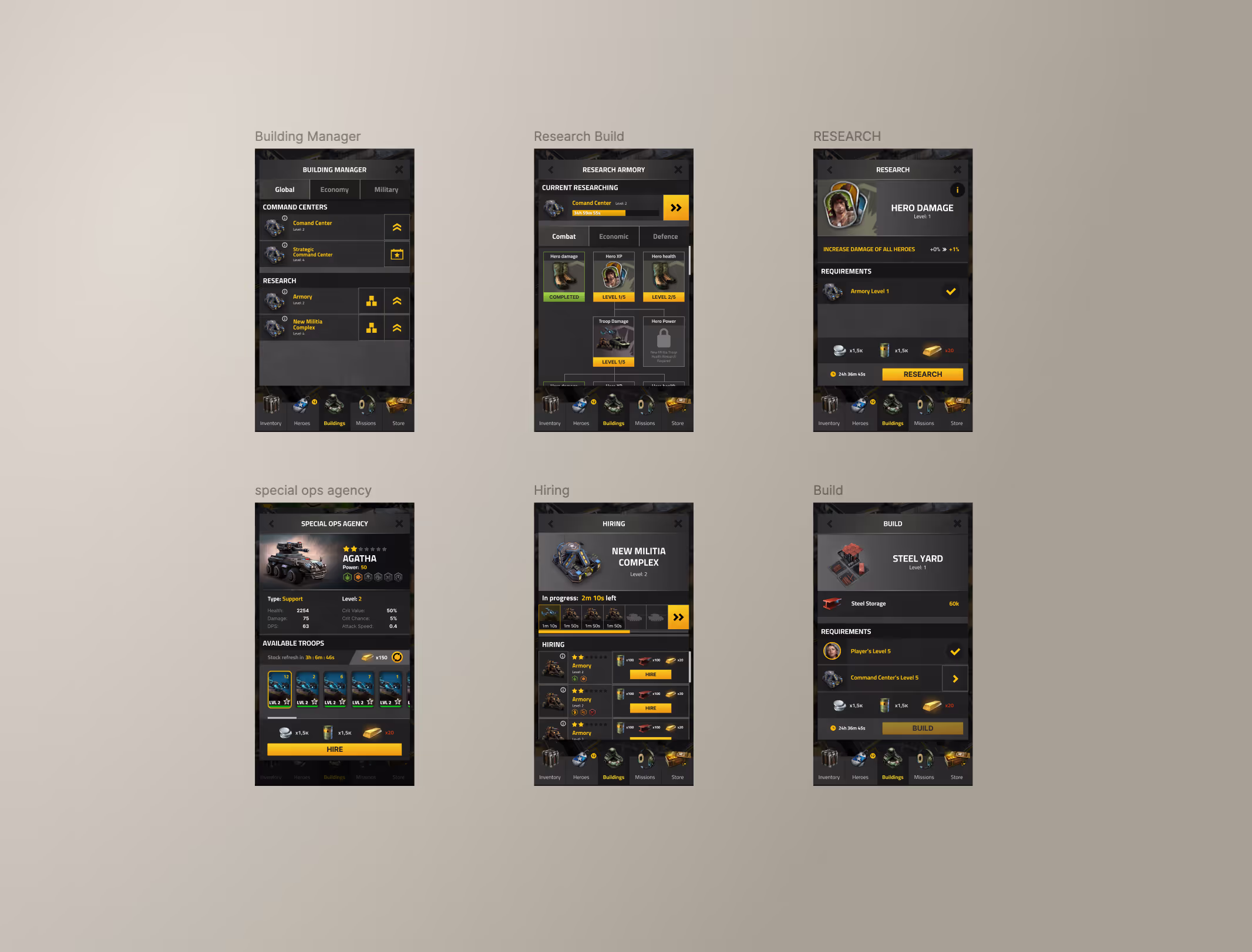
⊹ Simplified the complex pre-battle screen, improving navigation and usability

finish rate of tutorial
session time
churn rate for users that have played several sessions

Enhanced the game experience by improving store clarity, refining early-game pacing, optimizing onboarding for better tutorial completion, and enhancing battle visual feedback. Through intuitive UI design, streamlined navigation, and immersive visual elements, increased player engagement, retention, and overall usability.

I learned the importance of priorities and team work. That’s a common mistake to try change and do everything and as soon as possible, the game had a lot of potential improvement but we had a goal and priorities that we followed and achieved. The team worked as one organism with strong respect of each other work.

